Clients
Sasayaki Whiskey
Burn Charcoal
Good Trouble Whiskey
Forge
Tru Kava
Project Overview
A selection of unchosen comp work while at Moxie Sozo.


(01)
Sasayaki Whiskey
Smooth as a Whisper
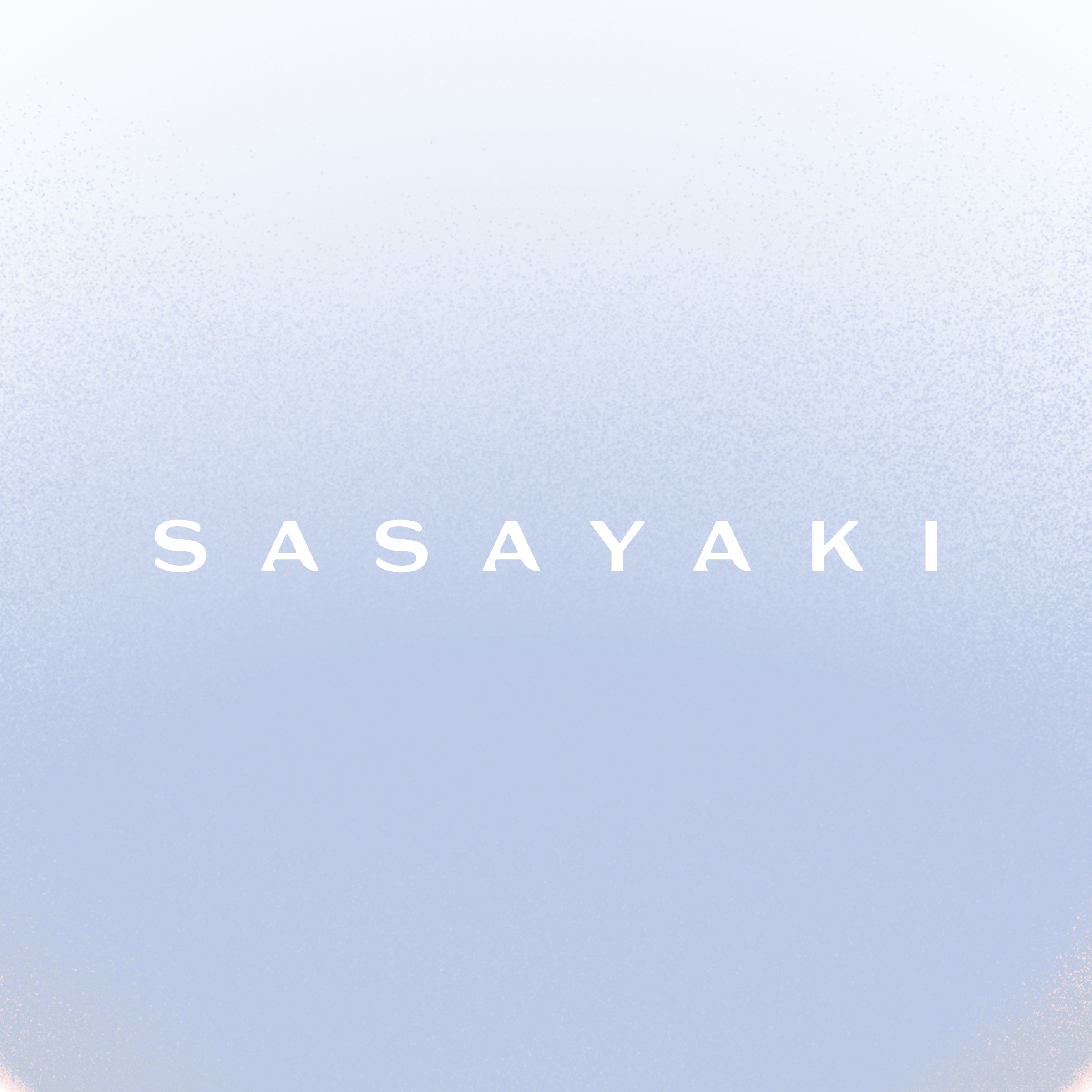
Premium Japanese whisky brand, Sasayaki, is a celebration of just how delicate and beautiful a whisky can be. It stands in quiet defiance against a world that reveres “loud.” It’s for those who appreciate elegant nuance and the artfully subtle.
Pulling inspiration from “whisper”—a soft, subtle sound—this premium label features a central circle which gradually dissipates into the label, as if appearing in its beautiful form and, at once, quietly dissapearing like a whisper in the air.


(02)
Burn Charcoal
Authentically Argentinian
Inspired by Fileteado Porteño, the decorative hand lettering and artistic style that is frequently spotted in Buenos Aires, Argentina, this packaging design for charcoal company, (then) Wild Burn highlights the standout attributes of the product inside: the long-burning charcoal from the Quebracho Blanco tree. Vignettes highlight key attributes of the product, while the custom wordmark provides a focal point and strong brand recognition.
Illustrations by Qian Lui


(03)
Good Trouble Whiskey
Good Trouble, Necessary Trouble
Good Trouble was inspired by the brand owner’s vision to spur social change through great bourbon and good conversations. An anti-bourbon of sorts.
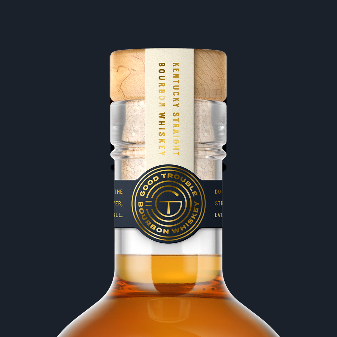
Using fonts sourced from black-owned type foundy, Vocal Type, I created a premium and sophisticated type- and photographic-forward direction that contrasts a distinctive and elegant wordmark with a march and handdrawn signage inspired font. The gold foil graphic overlaying the screened-back photo holds brand messaging— “Together, we find a way forward”—and communicates the idea of forward momentum and lighting a way forward.
Another easter egg can be spotted within the Good Trouble Whiskey emblem embossed on the label and tamper strip—completing the circles that eventual form into the GT monogram is an equal sign.
Carrie font by Vocal Type
LeMurmure font by Velvetyne


(04)
Forge
Altogether Different
Inspired by the brand idea of a “patchwork community” and a brand positioning that celebrates uniqueness in an era of cultural homogeneity, this visual identity weaves together pieces, colors, and textures of mix-matched sizes, shapes, and varieties, while creating a bright, modern, and fun backdrop for this apartment community.



(05)
Tru Kava
Modern Ritual
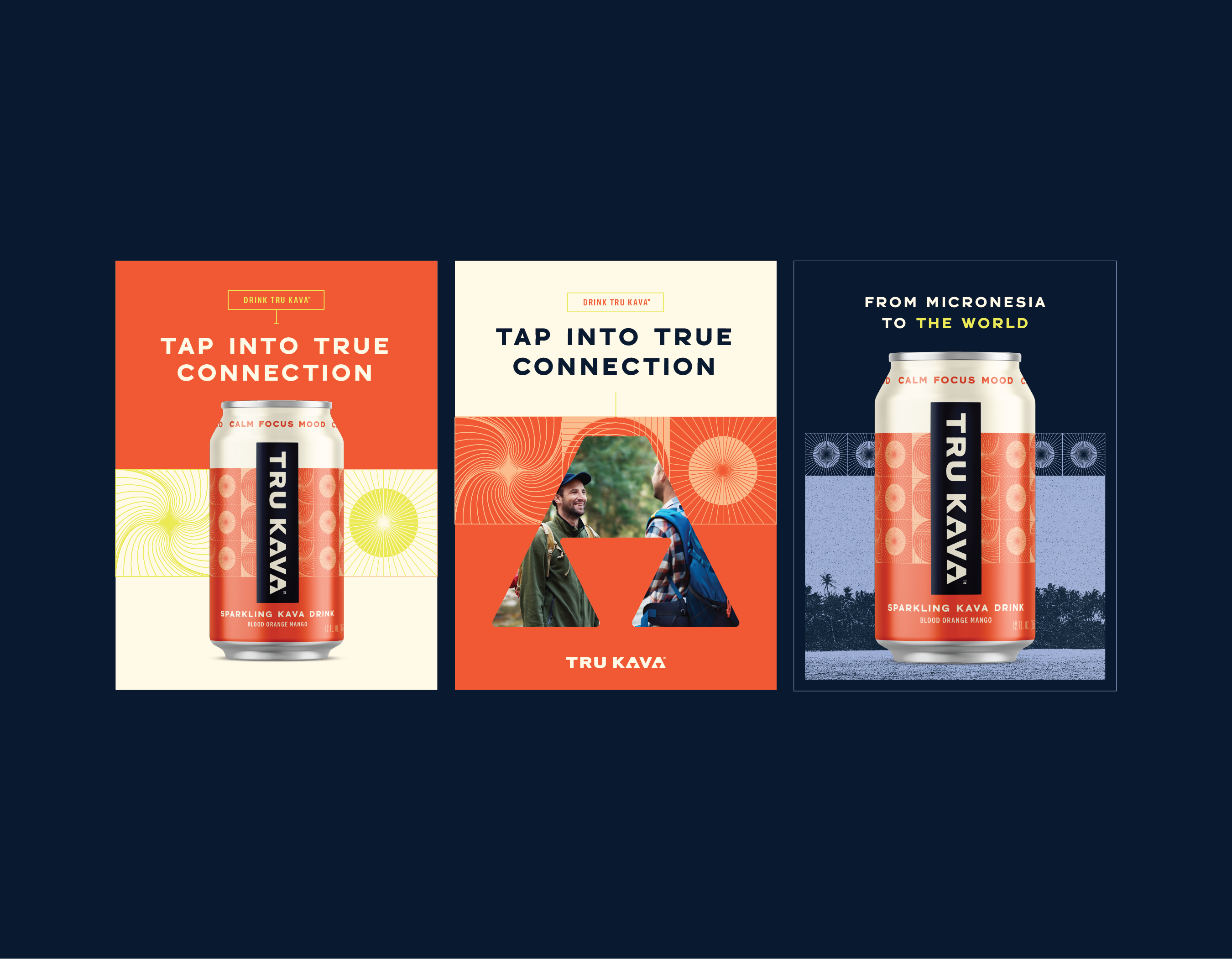
Tru Kava is a beverage company seeking to deliver the full therapeutic action of the traditional kava drink native to the South Pacific Islands by positioning their RTD and oil offerings as a wellness products. When you drink Tru kava or use its oils, you’re tapping into physical, spiritual, and global wellness.
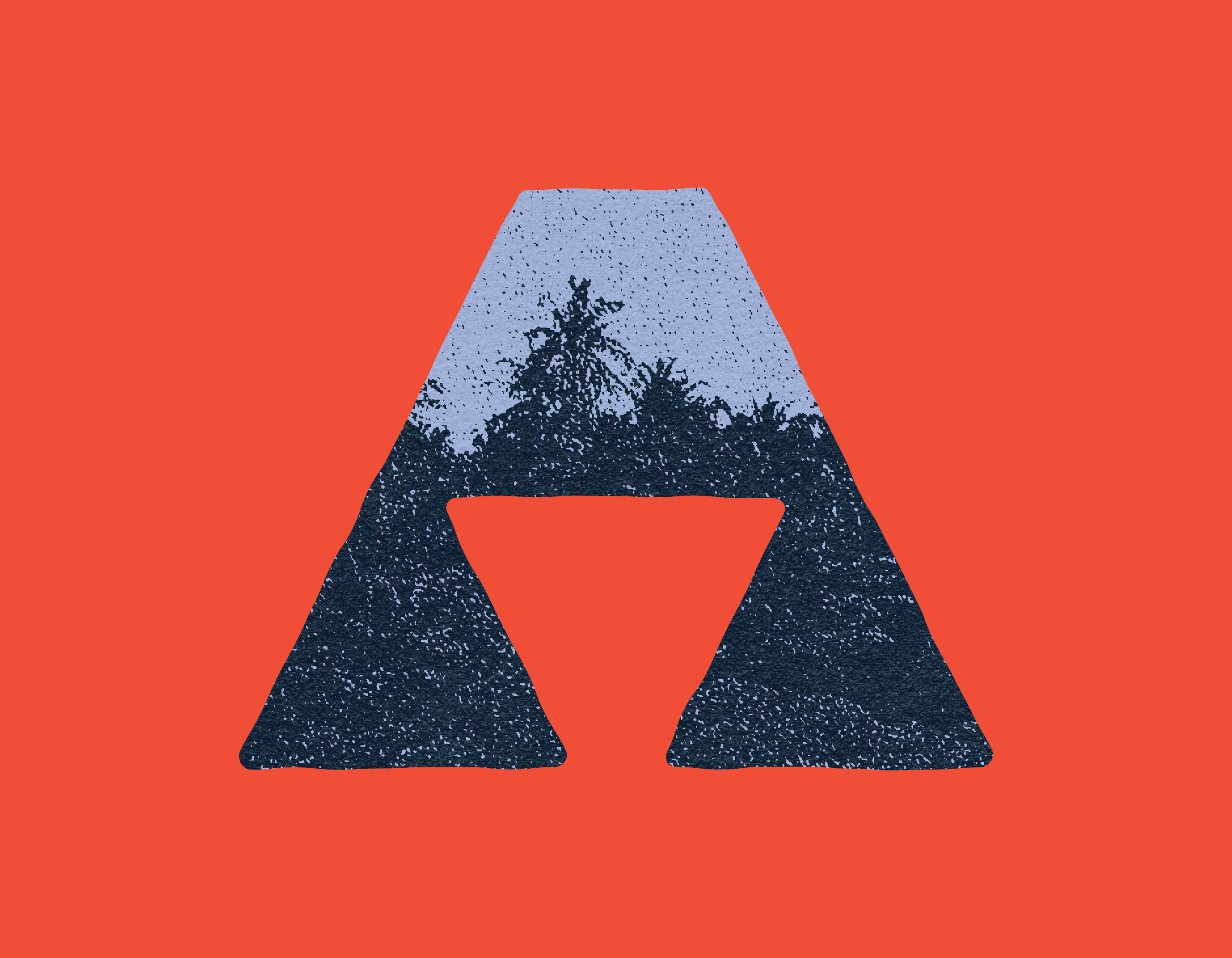
My direction, titled “Modern Ritual,” is a fresh take on traditional island artwork. This direction blends the old and the new creating a sophisticated brand that is rooted in tradition. At the core of the brand identity is a strong and bold wordmark, whose “A”s are a nod to the triad of wellness pillars that guide the brand positioning and visual identity.
On pack, a central "wellness" pattern—built up of icons designating calm, focus, and mood—lives behind the logo tag and anchors each SKU to the brand idea of global, spiritual, and physical wellness. The pattern also alludes to the idea of “connection” that is central to Tru Kava’s new positioning.
Flavor color occupies the majority of the can background for clear SKU differentiation and taste appeal, yet a consistent deep blue tag contains a large, vertical logo in contrasting off-white to keep the Tru Kava brand central and easy to spot.