Client
Conscious Foods™
Project Scope
Brand Identity
Project Overview
Visual identity for Conscious Foods™, the brand with produce on a mission.

(01)
Project Overview
Prouce on a mission.
Conscious™ Foods is an innovation company dedicated to building a healthier world—one salad or one blackberry at a time. Above all else, they want people to have access to a wider variety of better-made fruits and vegetables and more positive eating experience at home.
Conscious™ Foods scours the world for the most unique, flavorful, and interesting produce varieties, and then make them better. They use new kinds of innovation to deliver real benefits to you and your family—like keeping foods fresher for longer periods of time, or making fruits and vegetables consistently tastier.
They came to Moxie Sozo looking for a visual identity to help them enter the food technology scene.


(02)
The Challenge
Fruits, vegetables and technology
Conscious Foods is a brand that pairs the latest technology with tried-and-true farming to grow purposeful produce—thus, the primary challenge facing this visual indentity was balancing opposing qualities: taste appeal and technology, lifestyle and efficacy. We needed to convey trustworthiness, quality, and a sense of “trust us, this works,” while not leaving behind attributes like modernity, approachability, and taste appeal.
(03)
The Solution
The Conscious Foods™ Seal of Approval
Our solution is a balance of these things—approachability, modernity, technology, efficacy and taste appeal. We created a brand identity that feels relevant today and tomorrow, without compromising the heart of the brand.
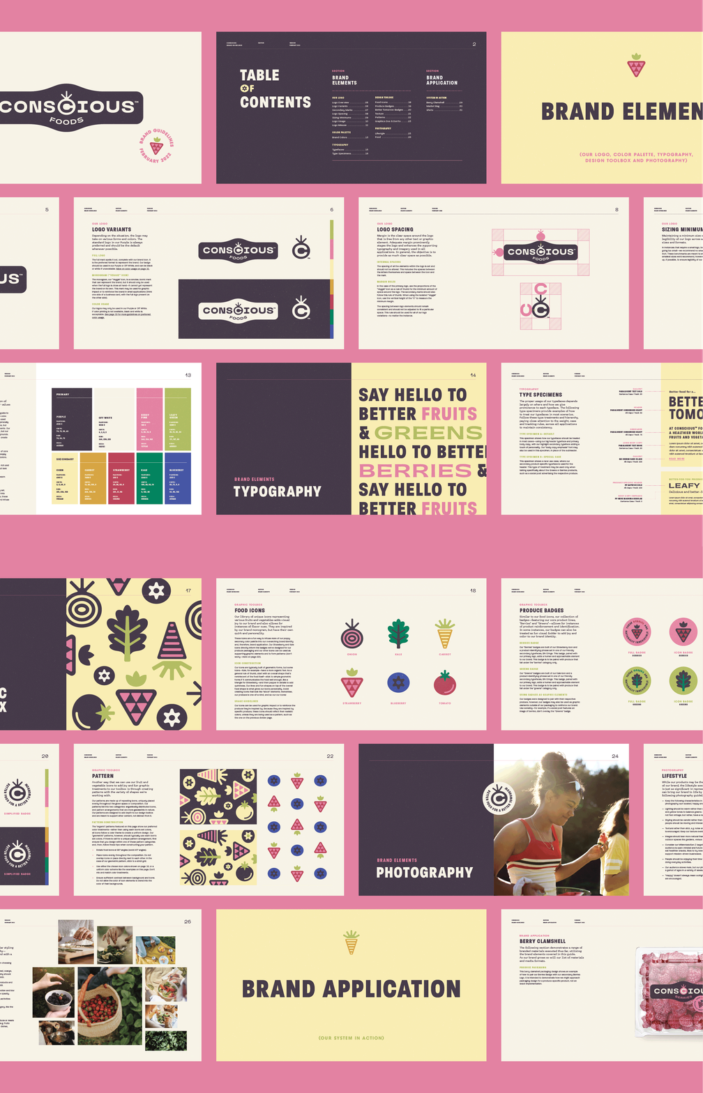
The resulting visual identity includes nods to technology in order to acknowledge the role that technology plays in the products, while differentiating from the technology space with warmer, approachable colors and a friendly library of badges and icons.
Our logo was constructed with our delicious and forward-thinking novel products in mind. The badge visually serves as a “stamp-of-approval” to reinforce our one-of-a-kind fruits and vegetables—it says: these greens and berries are nutritious and better-for-you snacks that were thoughtfully created by Conscious™ Foods.
Our blocky and geometric wordmark speaks to our forward-thinking and innovative nature; it captures a feeling of “technology in food” without leaning too scientific. Our organic badge shape and "Veggie" icon, paired with the funky sans typeface used for our "Foods" descriptor, introduces an approachability and friendliness to our identity.
