Client
Funny Farm
Project Scope
Brand Identity
Brand Strategy
Packaging Design
Custom Font
Project Overview
Brand identity and packaging design for Funny Farm, the food company that brings everybody to the table with fun foods more people can love.



(01)
Project Overview
Bringing more people to the table.
Newly-acquired Funny Farm knew it needed a rebrand to expand its audience beyond dietary restriction shoppers and into the mainstream. Moxie Sozo met the challenge with a fresh brand identity and packaging that highlighted its goat milk-based point of difference while heaping on taste appeal. The resulting packaging found its way to new shelves -- and pantries -- in nationwide distribution.




(02)
The Challenge
Starting from scratch.
Goat milk—which is A2 dairy rather than A1 dairy, like cow’s milk—sets Funny Farm Foods apart from its competitors. Studies show it’s easier to digest, which means that people who experience lactose intolerance might not have to sacrifice the rich flavors of dairy with products like Funny Farm’s macaroni and cheese or ice cream.
While the goat milk recipes are what differentiate Funny Farm from other food products, we had to keep in mind the barriers to purchase when it comes to the purchase and consumption of goat milk: taste and odor. We knew that taste appeal would be an especially important creative consideration moving forward.
In addition, it was important to avoid a look and feel that appeared too juvenile, yet still felt undeniably fun, in line with the company values, and communicated “goat.” Other creative challenges included: How do we communicate “goat”—our primarily point of differentiation—prominently without scaring away consumers who are concerned about the taste and odor of goat milk? How do we show the consumer that the product tastes good, even though it was made with goat milk? How do we communicate that these recipes are still creamy, delicious dairy products, only with a different kind of dairy? Where do we draw the line between “fun” and “funny”?


(03)
The Solution
Hand-crafted, goat goodness.
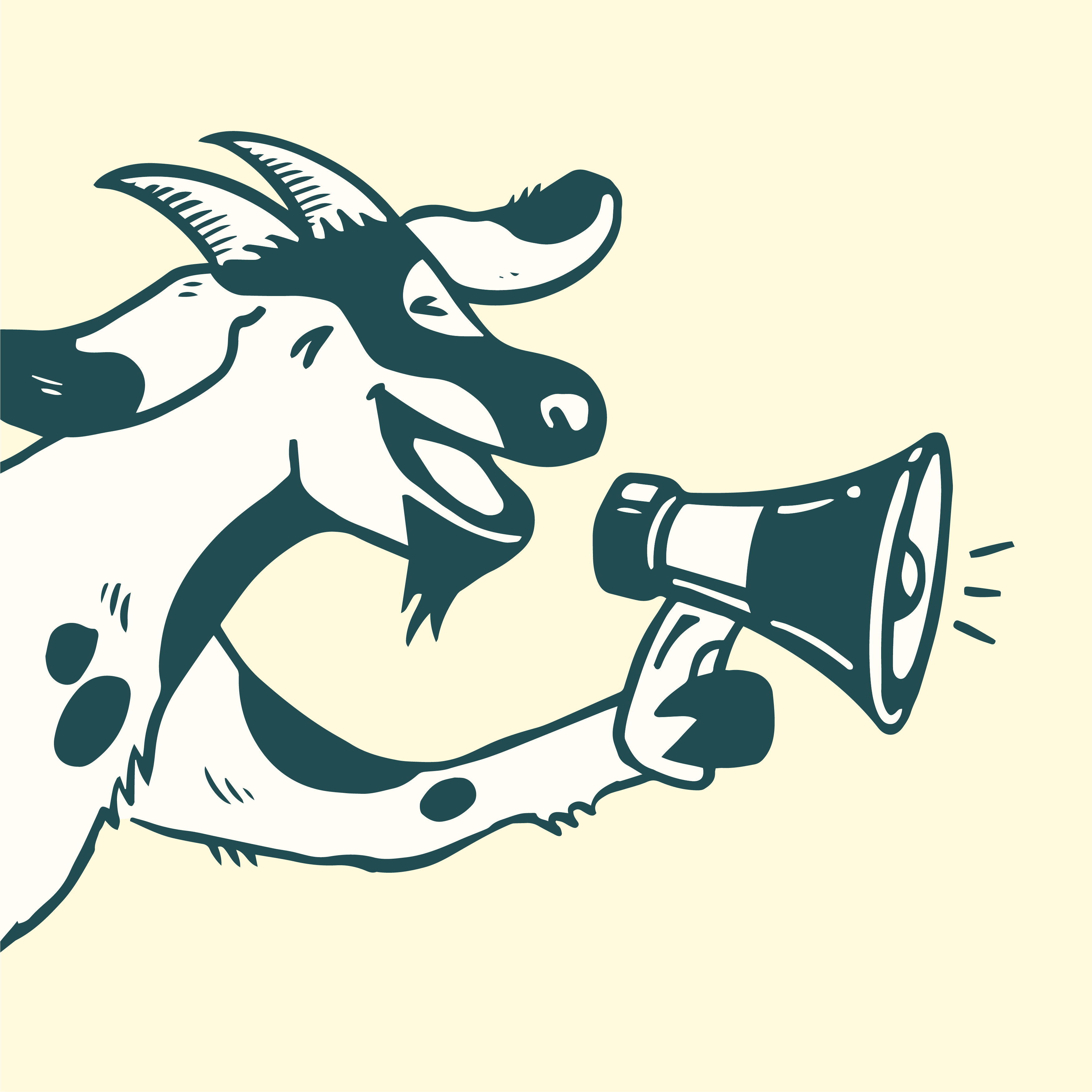
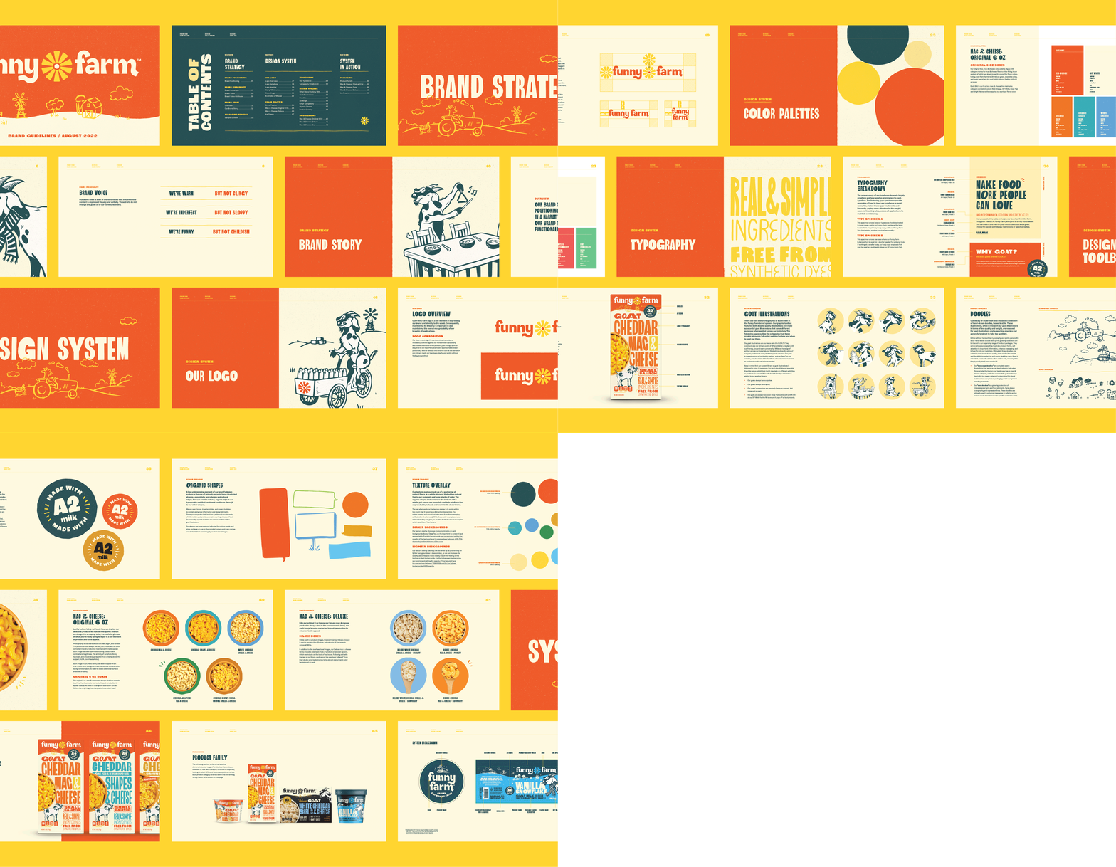
We knew that the new Funny Farm identity needed to be bespoke, yet unpretentious and still inclusive. Our design solution channeled quirky and bright energy into an identity and package design that feel hand-crafted and one-of-a-kind, supplemented by large and approachable messaging brought to life with hand-drawn typography, friendly goat illustrations to sell our point of differentiation, and product photography to highlight taste appeal. The new visual identity communicates approachability, warmth, fun, and—most importantly—goat goodness. Though not exclusive, the new identity is loud an d proud, and large messaging clearly informs consumers of the wholesome ingredients and benefits of goat’s milk.
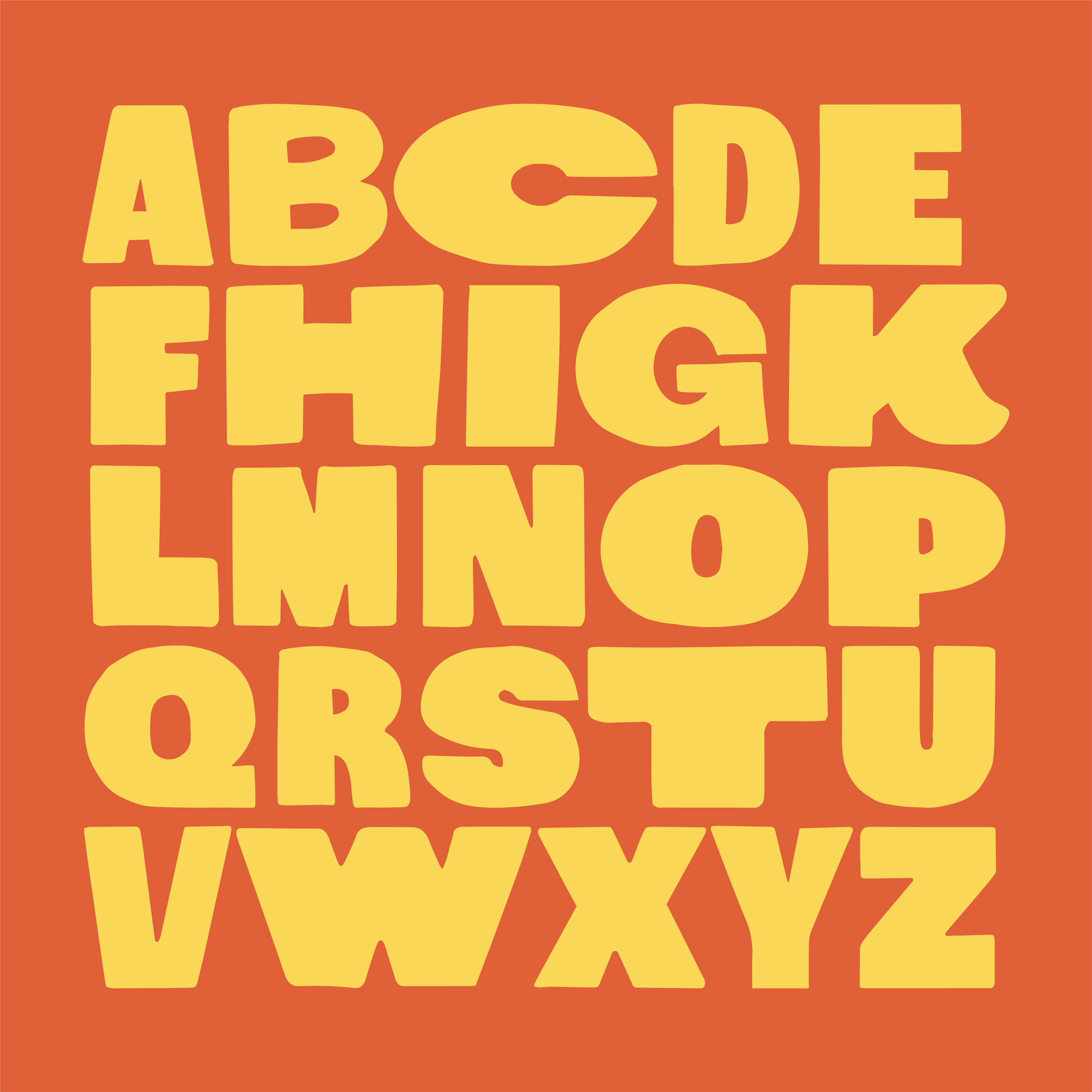
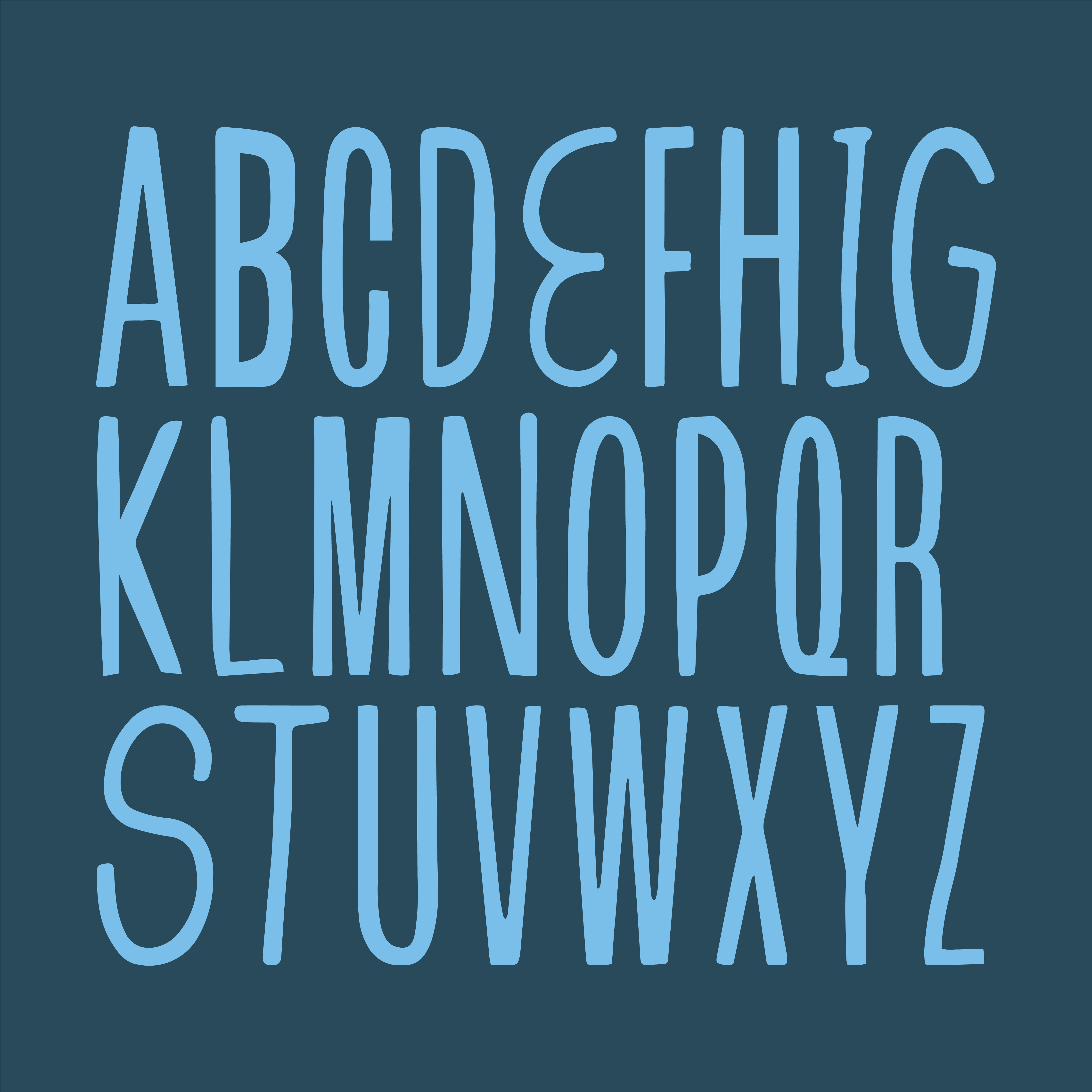
To achieve a one-of-a-kind identity, I created a custom Funny Farm font, designed to flex and adapt to a variety of sizes and platforms. Inspired by hand-painted signs and woodblock type, with a handful of quirk and personality, I developed a variety of weights, styles, and ligatures that were designed to be mixed and matched and paired together in endless ways, creating a unique outcome each time the font is used.
Funny Farm sources their goat milk from their co-op of family farms, so, in addition, we wanted to highlight the small-batch nature of these products on the packaging. For inspiration, we turned to hand-painted signs. The logo is a prime example—it has character and variety, and the versatile graphic in the middle can be seen as the top of a windmill, a flower, or a shining sun. Bespoke signage played a significant role in the fonts for the packaging design, giving the brand a handmade and unpretentious yet endearing look.

(04)
The Funny Farm Font
Hand-crafted, goat goodness.
We designed a custom, handwritten typeface for Funny Farm to capture the imperfect, hand-crafted, just-a-little-off personality of the brand. The Funny Farm font features four weights—Regular, Thin, Condensed, Extended—and most letters have a few alternate characters, mimicking the quirkiness and variability of real handwriting. The collection of weights were designed to be mixed and matched, creating quirky combinations of varying widths and thickness.
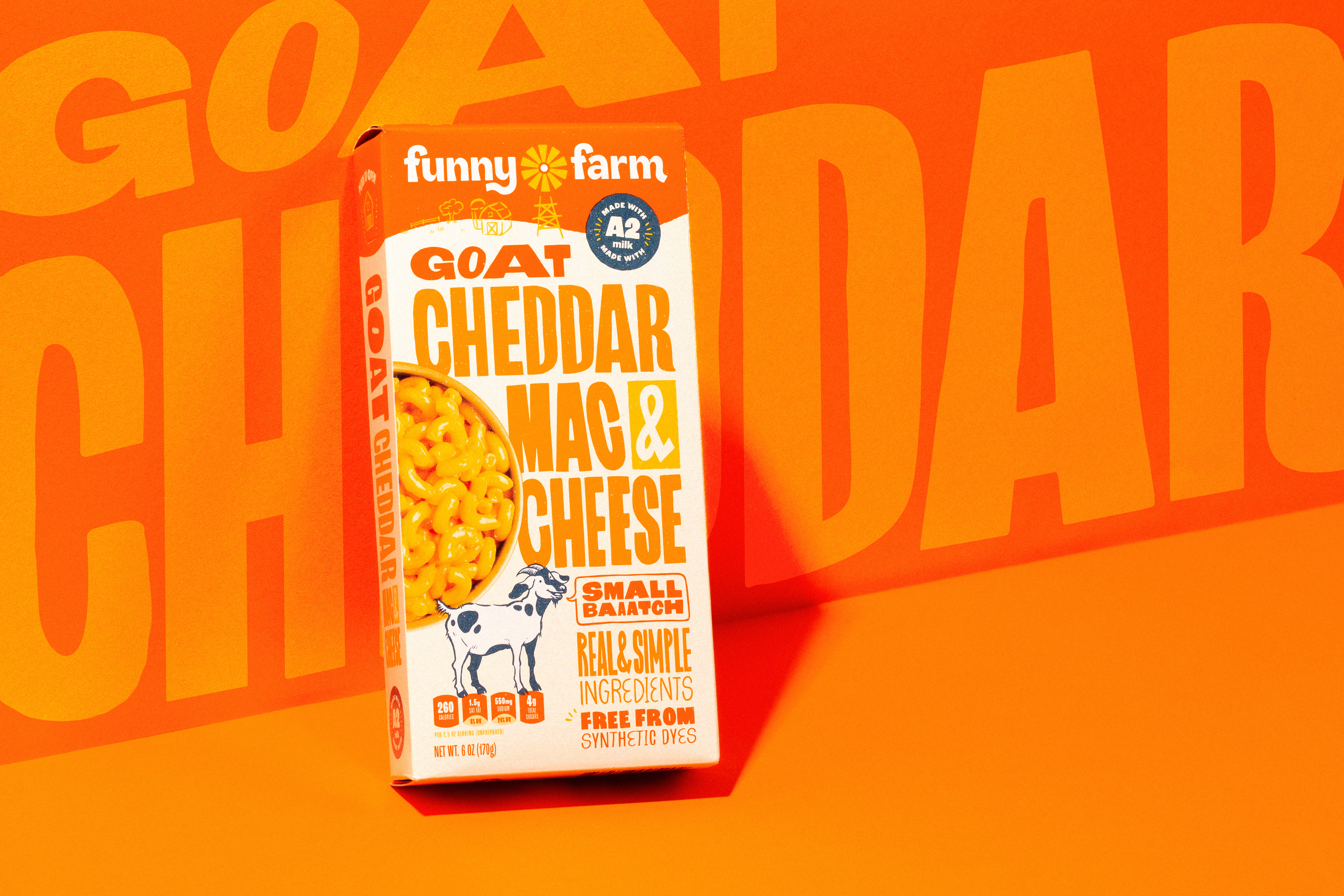
On pack, we utilize our typography in big ways. Our packaging characteristically has very few words and, by keeping our messaging short and sweet, we can maximize what's most important with our large, quirky letters. We let our flavors and unique offerings stand loudly and proudly and always support our products with important benefits. At times, our font is made quirkier by replacing a standard letter with an angled or slightly wonky alternate. With the Funny Farm font, the combinations are endless.


(05)
The Results
On more shelves, for more people to love.
The redesign has been such a positive step up from their prior packaging that Whole Foods, who previously removed the brand from the store, reaccepted Funny Farm Foods into their lineup. The Moxie Sozo team agreed that the goat image and font really capture people’s attention, and the rest of the pack informs consumers of the wholesome ingredients and benefits of goat’s milk. Everything from the font to the cartoon goat and farm-centric motifs, or the whimsical logo to the welcoming color palette, tells the consumer that this is a product for them regardless of dietary restrictions—and bringing more people to the table is what the brand is all about.


(06)
The Details
Credit
Designed at Moxie SozoDesign Lead: Sophie Bailey
Art Direction: Nate Dyer
Illustration Support: Nate Dyer + Lizzie Cox
Photography Team: Tyler Beckwith + Sophie Bailey
Press
The DielineNew branding unlocked placement in Whole Foods