Client
Tea Horse Road
Project Scope
Brand Identity
Packaging
Project Overview
Adapting glass tea bottles to a fresh, canned tea offering.
Full case study coming soon. ︎


(01)
Project Overview
Craft-brewed, authentic tea
Moxie Sozo had previously designed the brand identity and packaging look and feel for Tea Horse Road’s premium, glass-bottled line of teas when they approached us looking for a fresh take on their new, craft-brewed canned tea offering.
My role as lead designer, teaming up Qian Lui for illustration, was to design a unique layout and system for the canned teas, while still maintaining cohesion with the glass bottles.
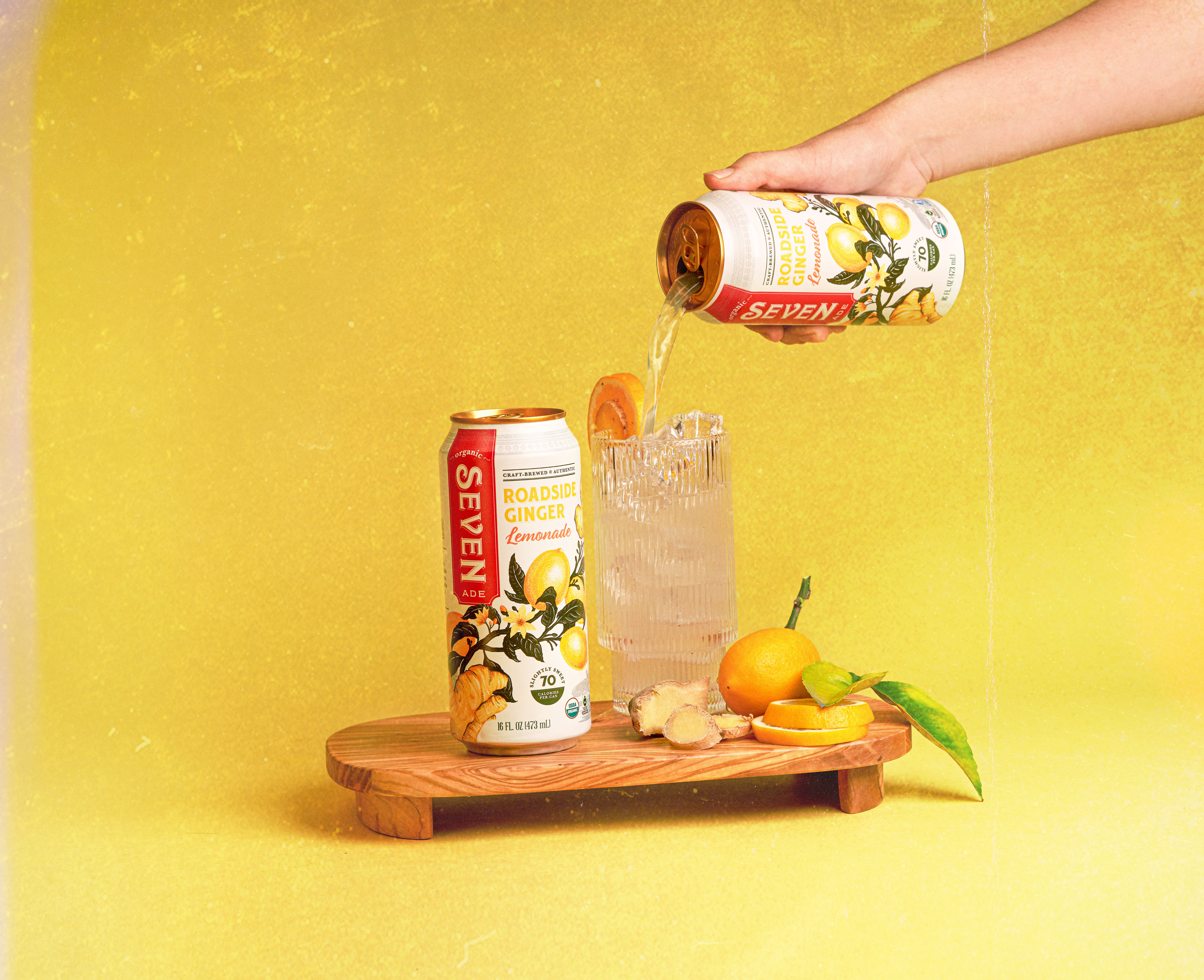
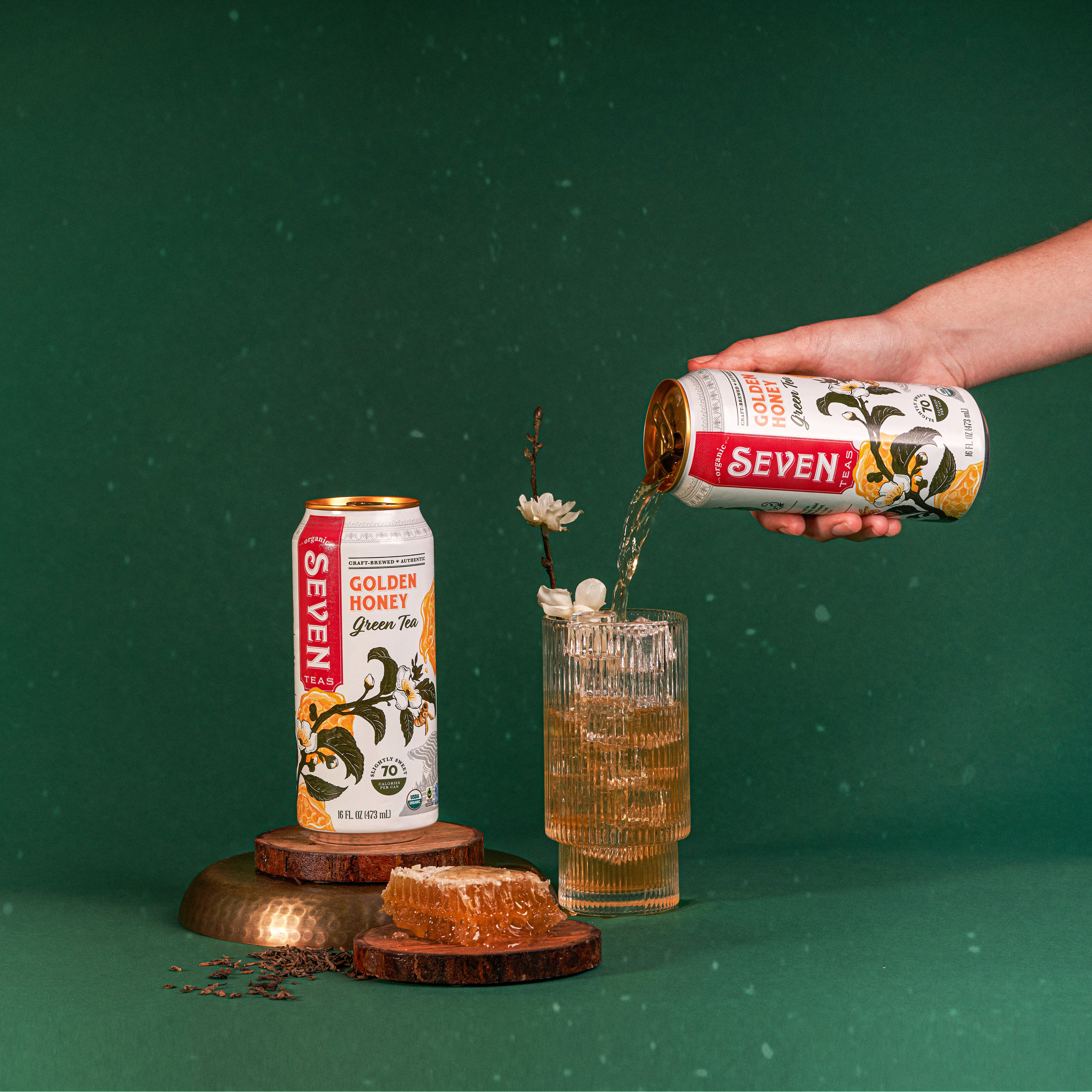
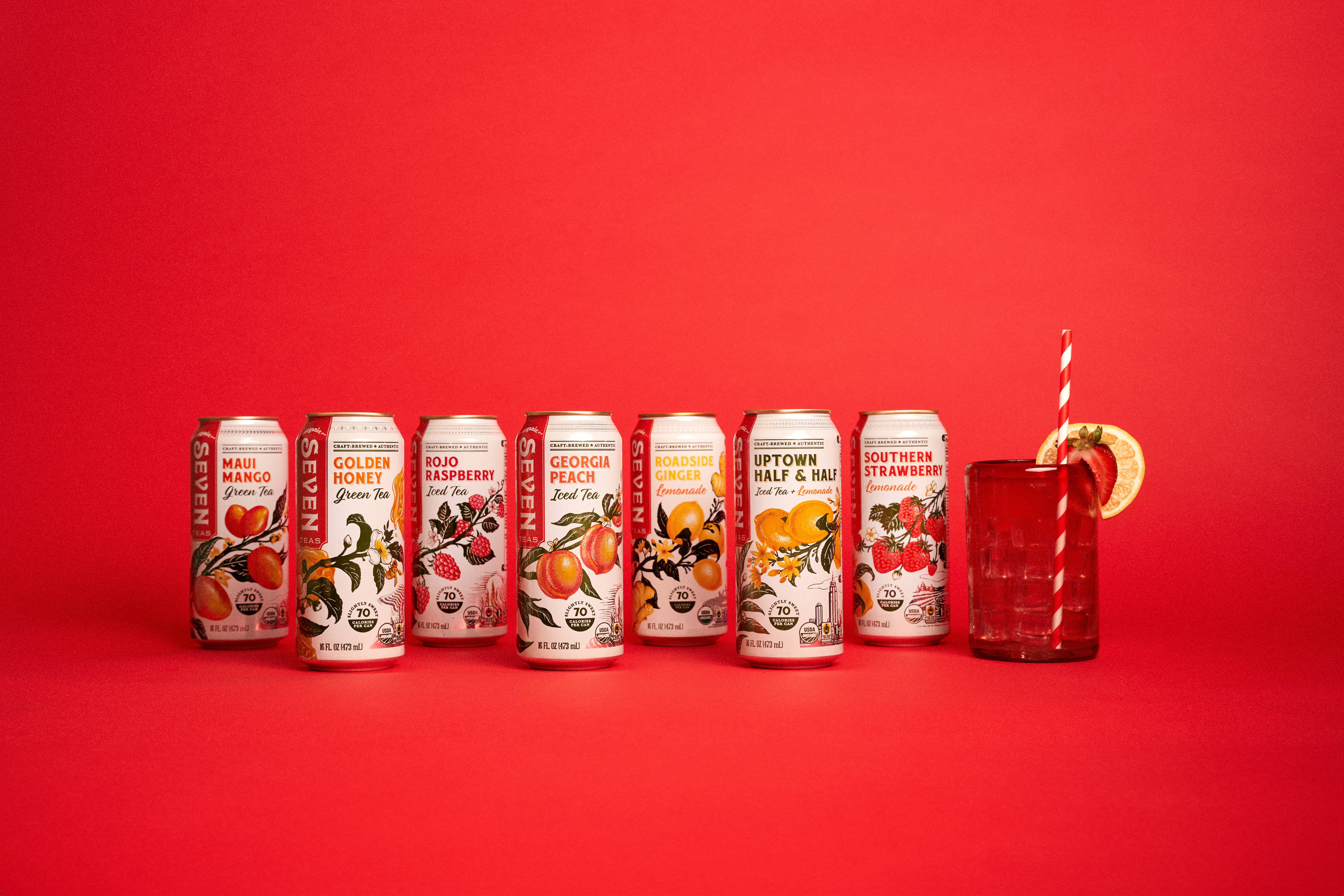
Designed with an asymmetrical illustration forging its way through the center of the can, each flavor of tea creates a sense of place through a unique illustration—created by the aluminum of the can showing through for a metallic finish—and decorative edges and borders inspired by the region or city. Stay tuned for a full case study on these details.


(02)
The Details
Credit
Designed at Moxie SozoDesign Lead: Sophie Bailey
Art Direction: Nate Dyer
Illustration: Qian Lui